Unified Demos
Unified Demos vs GTK-Demo
The most immediate problem with the default programs is that they cannot be searched and a novice programmer looking for help on using a certain function has to look at hundreds of lines before finding that function. Thanks to the Medit text editor, Unified Demos comes with two different interfaces for searching text:

A trivial improvement in Unified Demos is that it uses a resizable pane allowing you to actually see the names of all demos. Below you can see the difference for one of the demos with a long name.
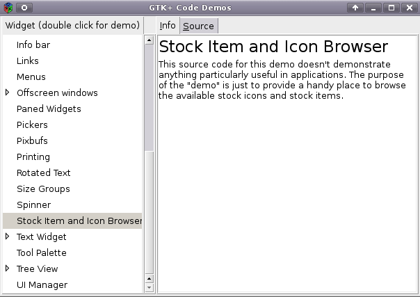
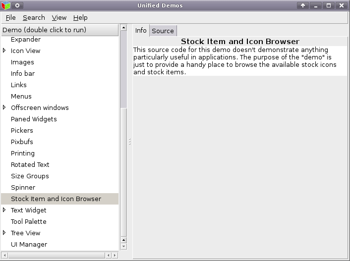
The demo programs are supposed to have the same look and feel but someone familiar with them can easily notice several disparities, raising the need for a unified interface.
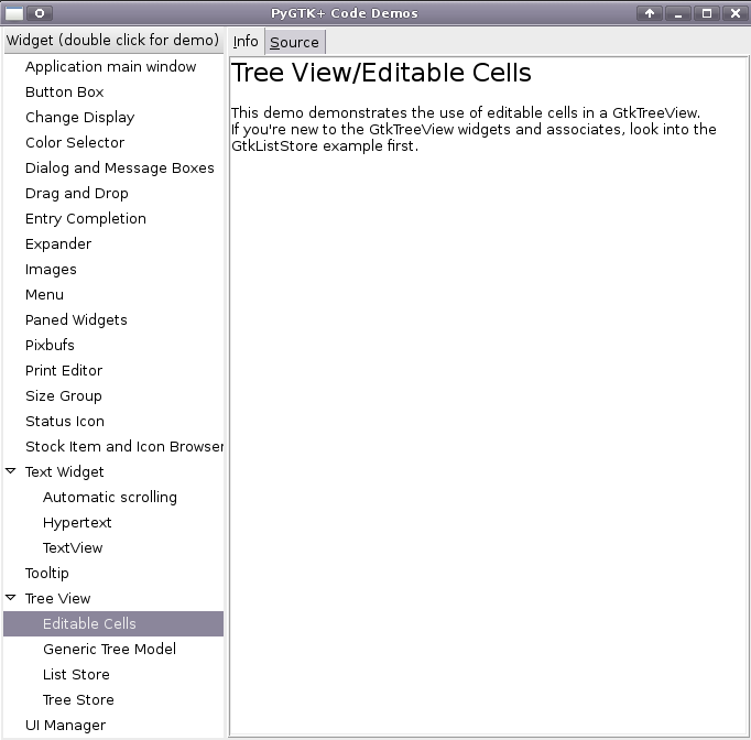

Here, we see what is essentially the same demo displayed in two different demo programs. The first takes the parent category and prepends it to the demo name while the second does not. Unified Demos sticks to a single convention throughout all of its demos and more importantly, makes it easy for the user to change the name.
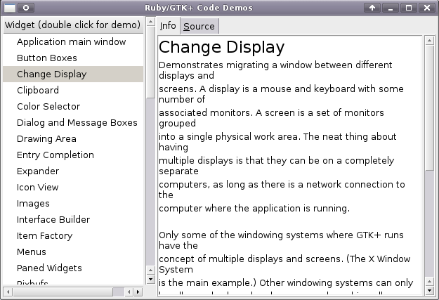
Another problem is that the Ruby and Python demo programs have hard returns inserted into the demo descriptions which becomes apparent when the user resizes the window. A user will not encounter this problem in Unified Demos unless he or she purposely ruins one of the text files.
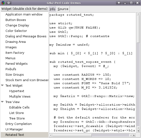
The Perl demo viewer above omits syntax highlighting for some reason and it has three demos that are not alphabetized.
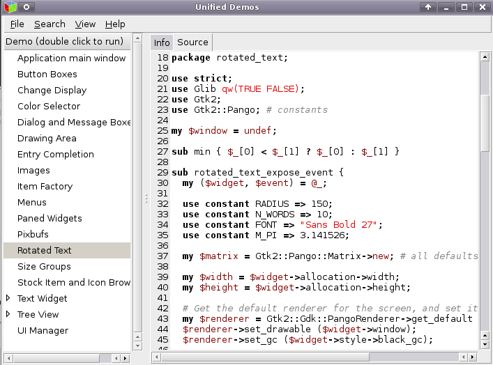
In Unified Demos, the same code is highlighted and its colour scheme agrees with the colour scheme used for all other languages. Also visible here is the line numbering feature. Please contact me if you know other reasons why Unified Demos is better than the default GTK+ demo programs.
Last updated: 2010-05-30 | Design by:
Hry online,
Croatia accommodation